Bringing Vibes to Life: The Branding Story behind Somos Parranda
At Creativo Rock, we love projects that let us blend creativity, strategy, and a touch of fun. One of our favorite collaborations has been with Somos Parranda, a Barcelona-based company whose very name means “Party”.
From the start, the challenge was clear: design a brand that radiates good vibes, celebrates the spirit of partying, but still feels modern and appealing to both younger and slightly older audiences.
The Concept
The identity of Somos Parranda was built around three key ideas:
Minimalist Visuals – clean, modern lines that provide structure without losing the fun.
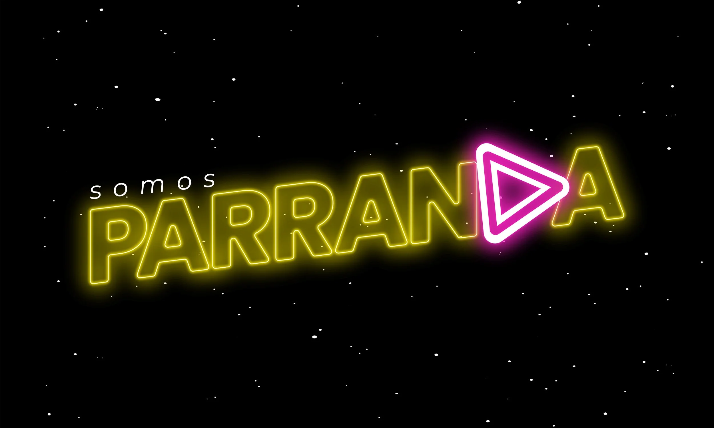
Retro Colors – Cyan, Magenta, Yellow, and Black (CMYK) bring back a retro palette with a vibrant punch.
Vibing Atmosphere – party-style photography, neon lights, spray-paint touches, and subtle movement make the brand dynamic and alive.

This fusion resulted in a branding that’s not just about parties—it’s about experiencing vibes, connections, and energy.
The Look & Feel


Colors: The bold CMYK palette reflects joy, nostalgia, and creativity.
Textures: Neon glow and spray art add energy and playfulness.
Imagery: Photography that captures real, vibing moments ensures authenticity.
Tone: Young, fresh, inclusive—welcoming everyone who loves to celebrate.
The final outcome is a visual identity system that instantly communicates “party,” while staying sleek enough to work across digital and print platforms.
Beyond the Brand: The Services Brochure
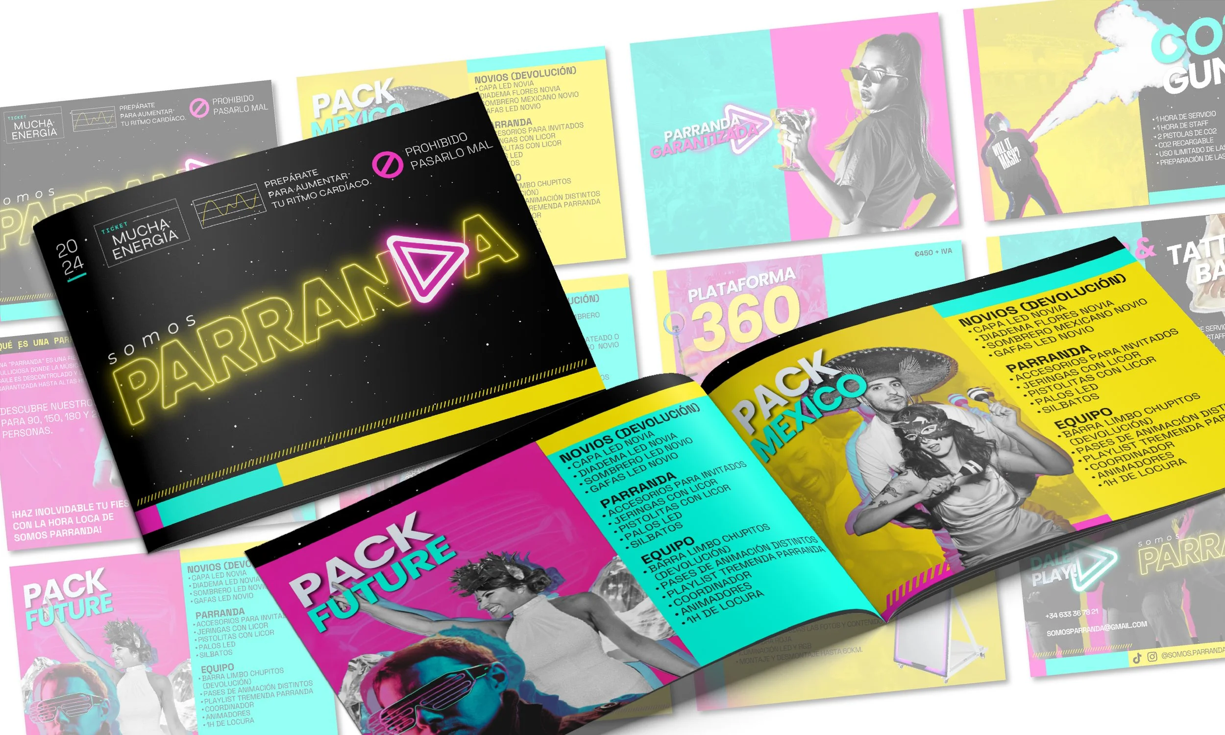
As part of the project, we also designed a promotional brochure to help Somos Parranda structure and present their services more effectively.
The brochure followed the same visual identity (minimalism + retro vibes), ensuring consistency across all touchpoints.
It was created as both a print-ready version for in-person events and a digital format for easy sharing online.
The design highlighted their services clearly, while maintaining the energetic party vibe that defines their brand.
This brochure became a powerful tool for attracting new clients and positioning Somos Parranda as a go-to company for events in Barcelona.
Why It Works
By balancing minimalism with vibrant details, the Somos Parranda brand feels both timeless and trendy. It invites people to celebrate life while maintaining a polished and professional presence that resonates across generations.
FAQs
-
Somos Parranda is based in Barcelona, Spain, a city known for its vibrant culture and nightlife—making it the perfect home for this energetic brand.
-
Cyan, Magenta, Yellow, and Black are both retro and modern. They bring boldness, flexibility, and a print-inspired energy that ties back to creativity and fun
-
It’s the balance: minimalist structure + retro palette + playful party elements. The result is a brand that feels professional yet full of life.
Ready to Rock Your Brand?
At Creativo Rock, we don’t just design—we create experiences. Whether you need a brand identity, web design, a marketing platform, or a complete communication strategy, our team knows how to turn ideas into powerful visuals and stories.