Case: Harmony Investments
At Creativo Rock, we had the privilege of working closely with a Toronto-based startup, Harmony Investment, to elevate their brand presence and bring their fintech vision to life. The company, specializing in blockchain technology and investment services, was at a crucial stage—starting from scratch. Through direct collaboration, we were able to craft a unique, standout identity that not only reflects their expertise but also promotes their core values of financial freedom and peace of mind.
What We Did
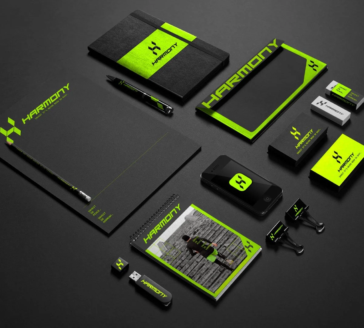
Our journey with Harmony Investment began with logo design—a geometric mark symbolizing the strength and security of blockchain technology. The design uses a powerful color palette of green, black, and dark gray, creating a refined, professional look that resonates with the fintech and financial worlds.
From there, we expanded the brand identity to encompass all key elements, including:
Branding: A modern, clean, and easily recognizable visual identity.
Stationery: Custom-designed corporate materials that reflect the brand’s professionalism.
Social Media: A comprehensive content strategy with eye-catching visuals and engaging posts.
Website Design: A responsive, user-friendly site that tells the brand’s story and promotes its services.
Advertisement Images: Custom graphics to help Harmony Investment attract potential investors.
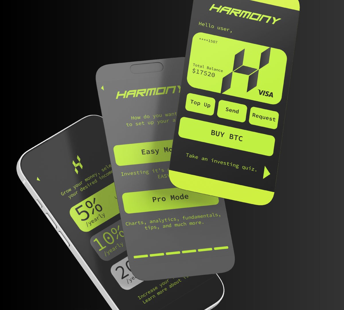
App Proposal: A UX/UI design proposal for their upcoming app to further streamline user experience.
Credit Card Design: Custom-designed credit cards that align with the brand’s visual identity.


The core of our design concept revolved around financial freedom—depicting lifestyles like surfing, hiking, and running, symbolizing how Harmony Investment handles your finances so you can focus on living freely.
We also crafted impactful slogans like “Investing has never been easier” and “Invest in peace, Invest in Harmony,” which perfectly aligned with the company’s mission.
Results
Our collaborative efforts with Harmony Investment have not only produced a bold, impactful visual identity, but have also significantly enhanced their presence in the competitive fintech market. The geometric logo, modern branding, and well-thought-out design elements have helped establish a strong brand recognition across their digital platforms.
The green, black, and dark gray color palette helps convey trust and stability—key factors in the financial sector—while the lifestyle imagery creates a connection with their audience’s desire for financial freedom. All of this combined has led to a cohesive brand presence that’s resonated well with potential clients and investors.
-
Our approach combines geometric design, strategic color choices, and lifestyle-oriented visuals to create a brand identity that not only looks appealing but speaks directly to the core values of financial freedom and security—two essential elements for any fintech business.
-
At Creativo Rock, we believe in direct collaboration with our clients. We take the time to understand their vision and goals, providing them with creative solutions every step of the way. This partnership allows us to create work that aligns perfectly with their brand ethos.
-
Our design process starts with understanding the essence of the client’s business. We then use visual storytelling to ensure the brand’s identity is not only unique but speaks to its audience. For Harmony Investment, this meant designing a brand that represents both technology and financial freedom, while also being visually appealing and approachable.


