
We’d love to hear from you — whether you have a project in mind, or just want to say hi.
hello@creativorock.com

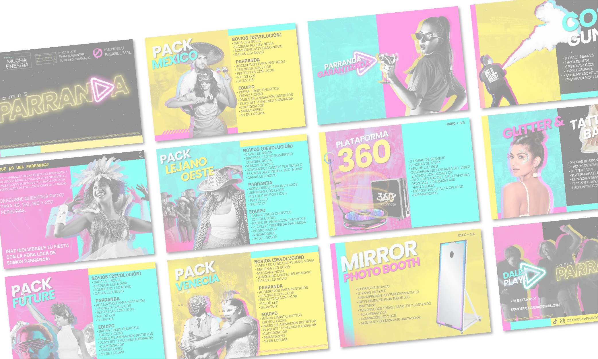
Somos Parranda needed a brand identity capable of representing the energy and excitement of party culture while still maintaining a clean and modern visual direction that could appeal to different generations.
The challenge was finding the right balance between minimalism, vibrant visuals, and a youthful atmosphere without creating something that felt visually overwhelming or overly trendy.
Another important goal involved creating a visual system flexible enough to work consistently across both digital platforms and print materials, including promotional brochures, event marketing assets, and social media content.
The brand also needed to stand out within Barcelona’s competitive entertainment and events scene while creating an emotional connection centered around celebration, community, and shared experiences.

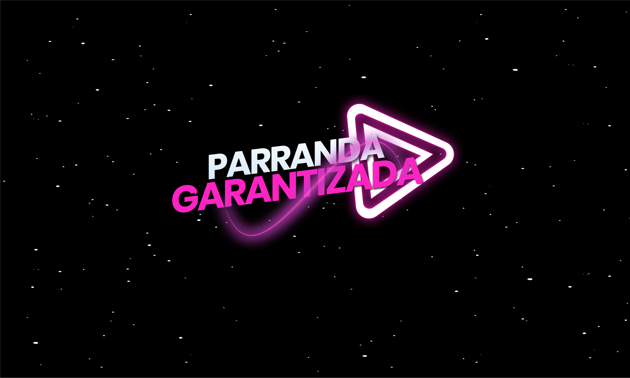
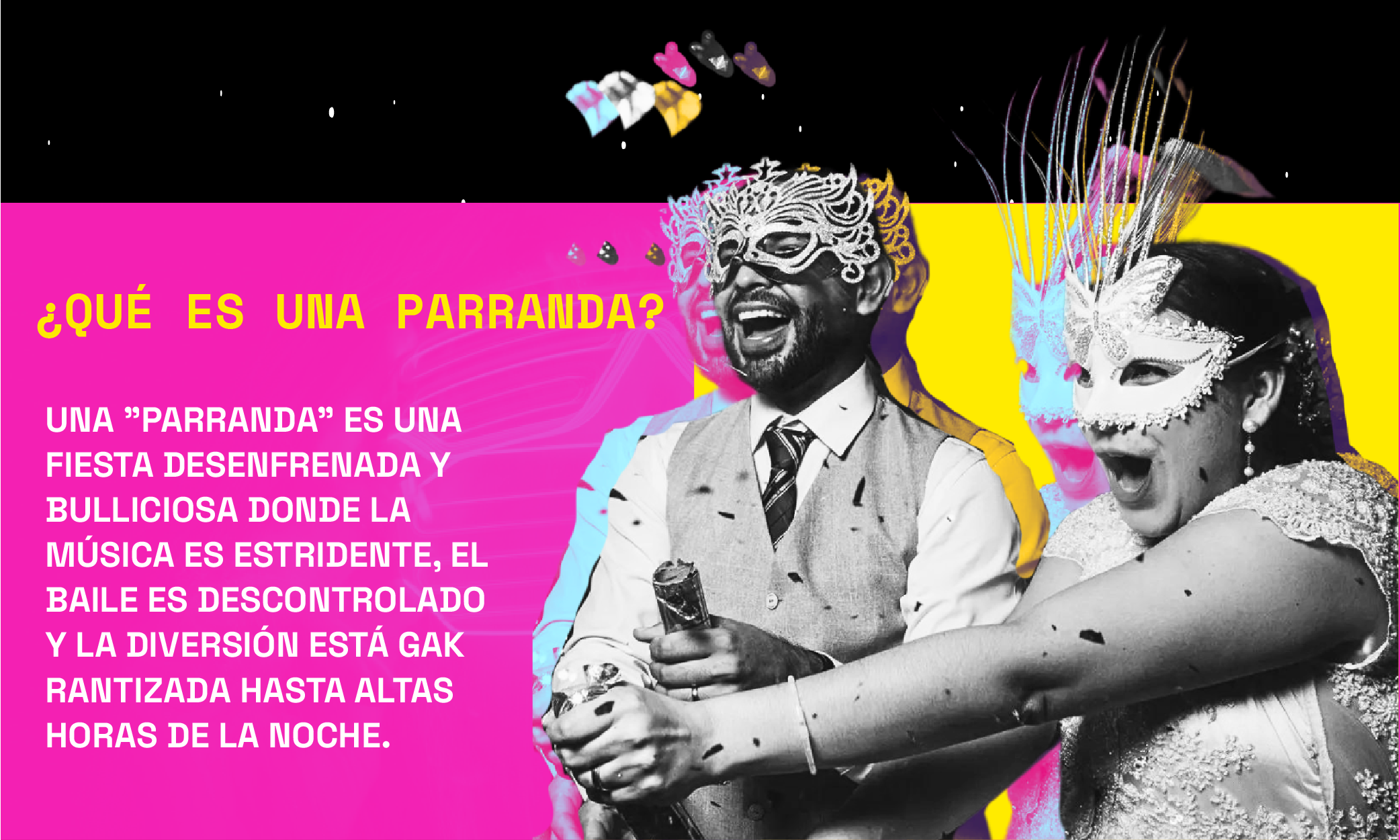
At Creativo Rock, we developed a complete visual identity system inspired by the concepts of energy, nostalgia, creativity, and connection.
The branding strategy focused on three main creative pillars:
• Minimalist visual structure to keep the brand clean and modern
• A bold CMYK inspired color palette featuring cyan, magenta, yellow, and black
• Dynamic visual elements inspired by nightlife, neon lighting, spray paint textures, and party culture
Using tools such as Photoshop and Illustrator, we crafted a visual language that feels vibrant and expressive while remaining highly adaptable across multiple formats and platforms.
The overall art direction incorporated:
• Neon inspired glow effects
• Editorial style party photography
• Spray paint inspired textures
• Bold typography and energetic compositions
• Modern layouts with retro inspired aesthetics
Alongside the branding system, we also designed a complete services brochure that allowed Somos Parranda to present its offerings more professionally to potential clients and event partners.
The brochure was developed in both digital and print ready formats, helping the company maintain a consistent visual presence across online promotion, in person networking, and event related marketing materials.
Every design element was carefully aligned with the overall identity to ensure the brand communicated a strong sense of celebration, inclusivity, and modern nightlife culture.
The collaboration with Somos Parranda resulted in a highly recognizable and emotionally engaging brand identity capable of standing out within Barcelona’s competitive entertainment industry.
The combination of minimalist structure and vibrant visual elements created a branding system that feels both modern and timeless while maintaining a strong connection to party culture and social experiences.
The visual identity successfully translated across brochures, digital platforms, promotional graphics, and print materials while helping establish stronger brand consistency and recognition.
The newly designed services brochure also became an important tool for presenting the company professionally during networking opportunities, partnerships, and client outreach efforts.
Most importantly, the project helped position Somos Parranda as a fresh and visually distinctive entertainment brand built around connection, celebration, and unforgettable experiences.