


We’d love to hear from you — whether you have a project in mind, or just want to say hi.
hello@creativorock.com

Harmony Investments was at an early stage and needed a complete visual identity that could position the company professionally within the competitive fintech and blockchain industry. The challenge was to create a brand that felt modern, secure, and approachable while also communicating concepts like financial freedom, trust, and innovation.
The company needed a cohesive digital presence that could connect with potential investors and users across multiple platforms while standing out visually in a highly saturated market.

At Creativo Rock, we worked closely with the Harmony Investments team to develop a complete branding and digital design system tailored to their goals and audience.
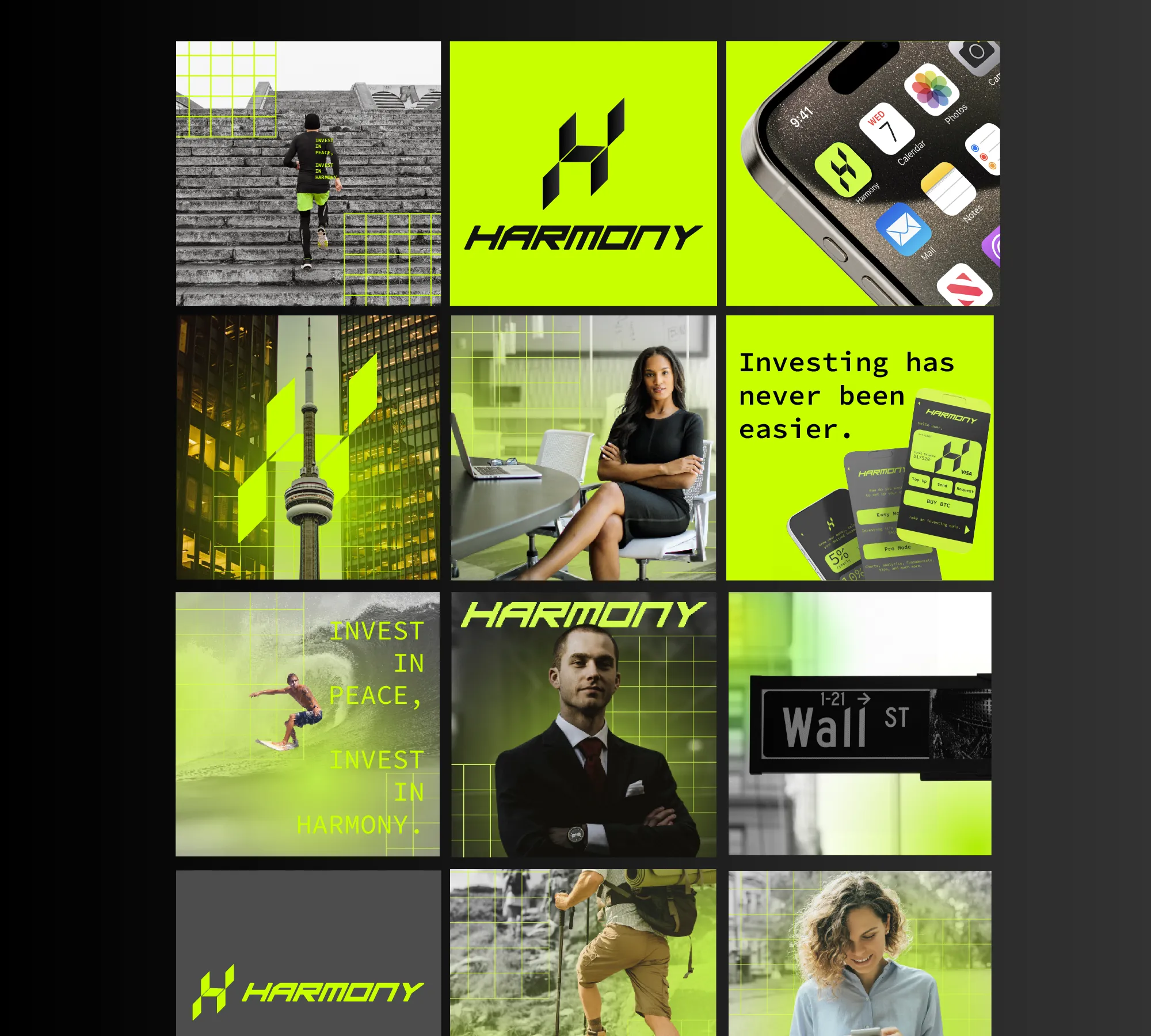
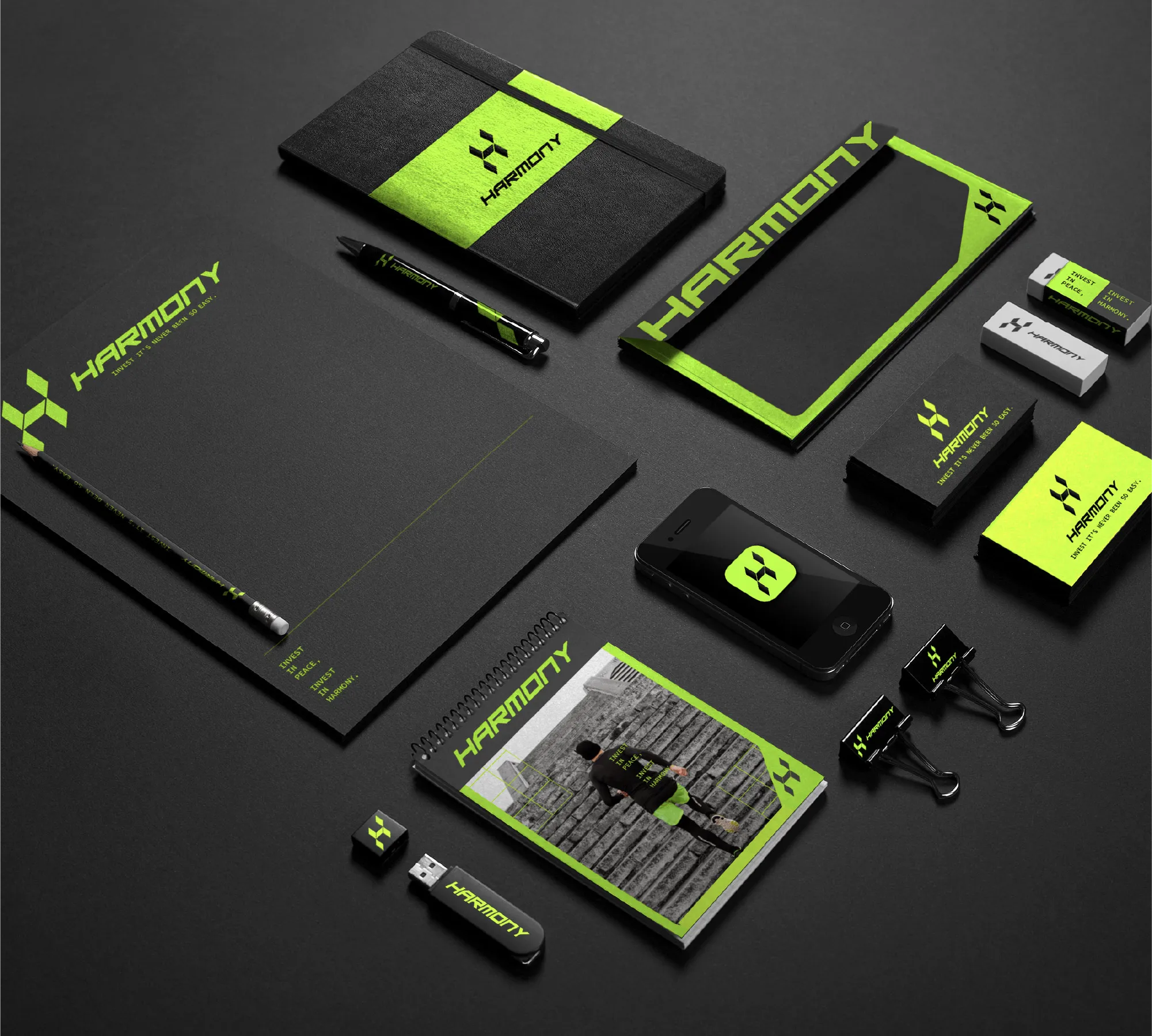
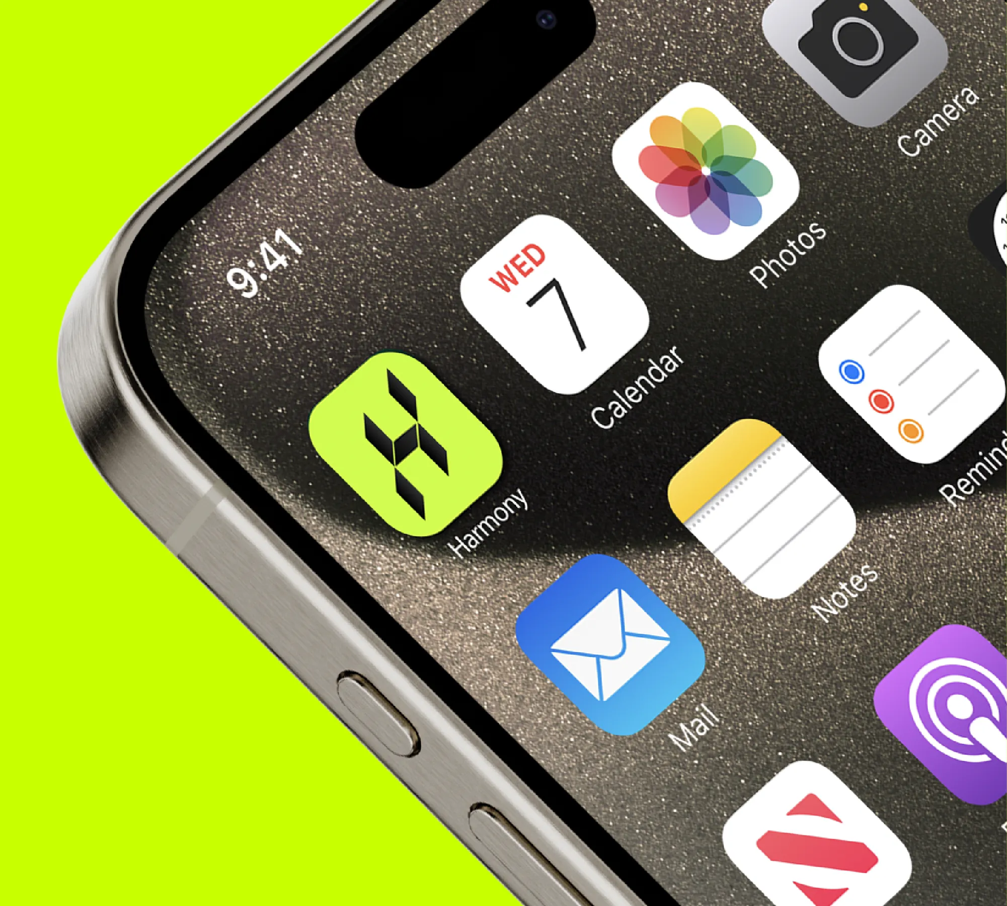
The project started with the creation of a geometric logo inspired by the strength and security of blockchain technology. We developed a refined visual identity using a carefully selected palette of green, black, and dark gray tones to reinforce trust, professionalism, and stability.
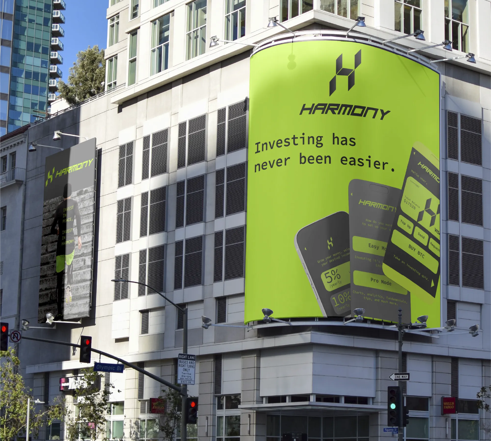
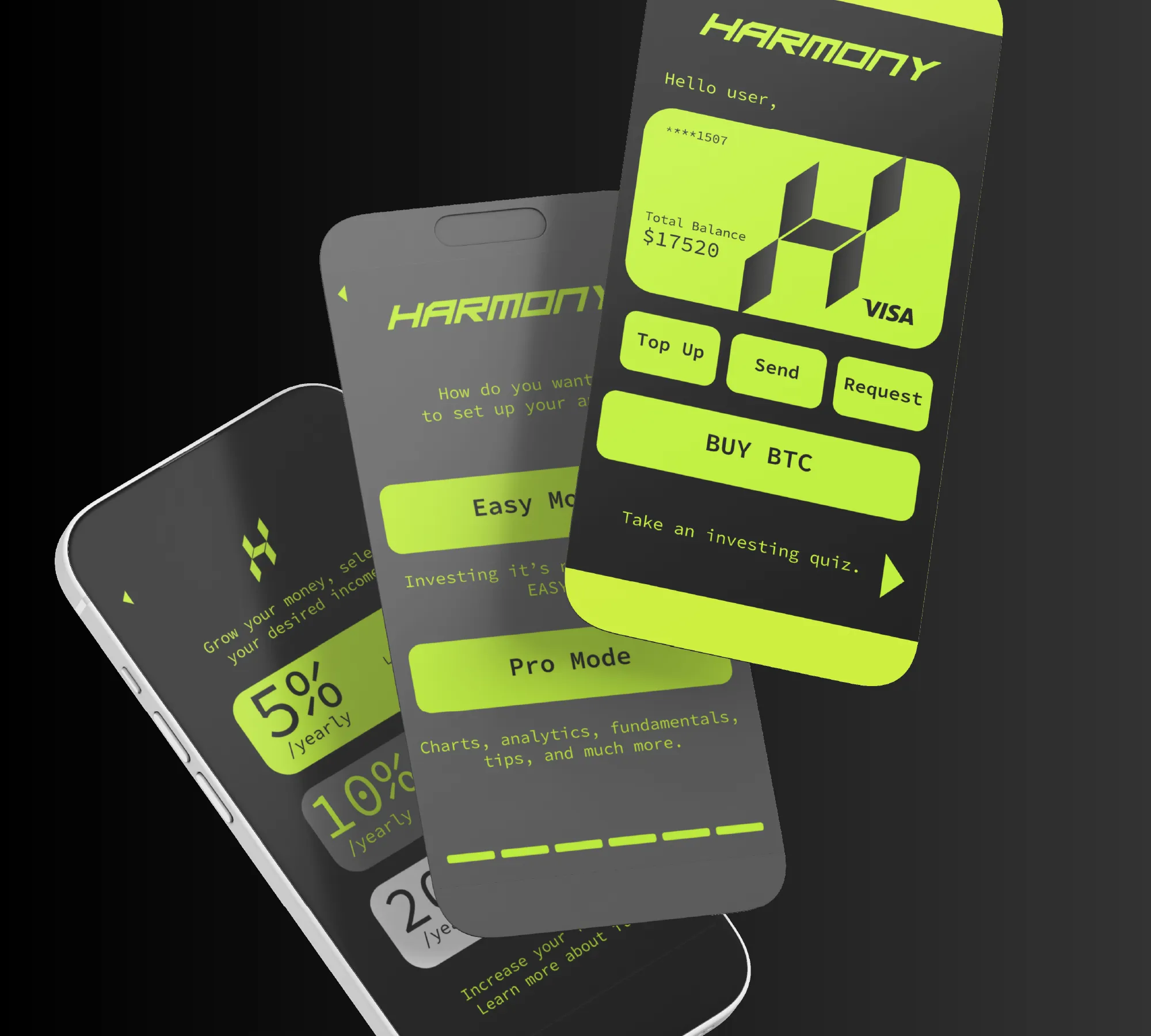
From there, we expanded the project into a full brand ecosystem including website design, social media content, advertisement graphics, stationery, and custom credit card concepts. We also created a UX/UI proposal for their future mobile app experience.
The creative direction focused heavily on the concept of financial freedom. Through lifestyle oriented visuals inspired by surfing, hiking, and outdoor activities, the brand communicates the idea that Harmony Investments handles your finances so you can focus on living freely.
To strengthen the messaging, we developed slogans such as “Investing has never been easier” and “Invest in peace, Invest in Harmony” to align with the company’s mission and values.

The final result was a bold and cohesive brand identity that helped Harmony Investments establish a strong digital presence within the fintech space.
The combination of geometric branding, modern design systems, and strategic visual storytelling created a recognizable and professional image across all platforms. The green and dark color palette reinforced feelings of trustand stability while the lifestyle based creative direction helped build an emotional connection with the audience.
The project successfully positioned Harmony Investments as a modern and approachable fintech company prepared to grow within a competitive market.