


We’d love to hear from you — whether you have a project in mind, or just want to say hi.
hello@creativorock.com
At Creativo Rock, we believe that strong branding goes far beyond a logo. A brand is built through consistency, communication, structure, and strategy.
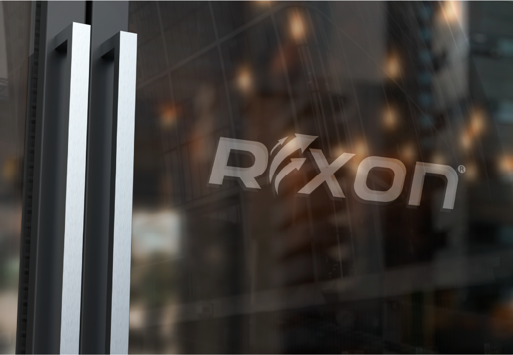
When Rexon, an international company specialized in hoses, automotive belts, industrial supplies, and car parts, approached us, they were not looking for a completely new logo.
Instead, they needed something deeper:
A complete brand identity transformation capable of unifying their communication across multiple departments, industries, and international markets.
Over time, Rexon’s marketing materials, advertising assets, internal communications, and visual presentations had become inconsistent across platforms.
The company faced several branding challenges:
• Fragmented visual communication
• Inconsistent marketing materials
• Lack of unified brand standards
• Different departments using disconnected visual styles
• Weak cohesion between digital and print communications
The challenge was clear:
Create a stronger and more professional corporate identity system without changing the existing logo that already carried brand recognition and history.
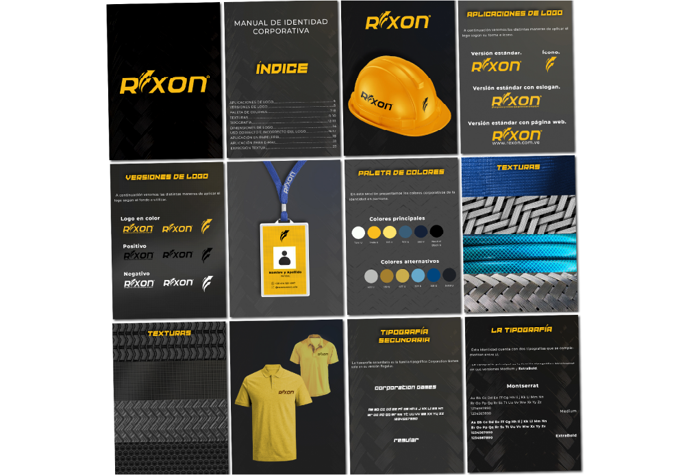
At Creativo Rock, we approached the project strategically by focusing on the creation of a complete Brand Identity Manual designed to bring structure, consistency, and scalability to Rexon’s communication systems.
Using tools such as Illustrator, Photoshop, and professional brand development workflows, we created a detailed branding framework capable of guiding every department and communication channel within the company.
The new brand manual included:
• Visual identity standards
• Updated color palette systems
• Typography guidelines
• Photography direction and visual style
• Tone of voice recommendations
• Internal and external communication standards
• Digital and print branding applications
• Marketing and advertising templates
• Packaging and merchandising guidelines
This document became the foundation for Rexon’s long term branding strategy and daily communication processes.
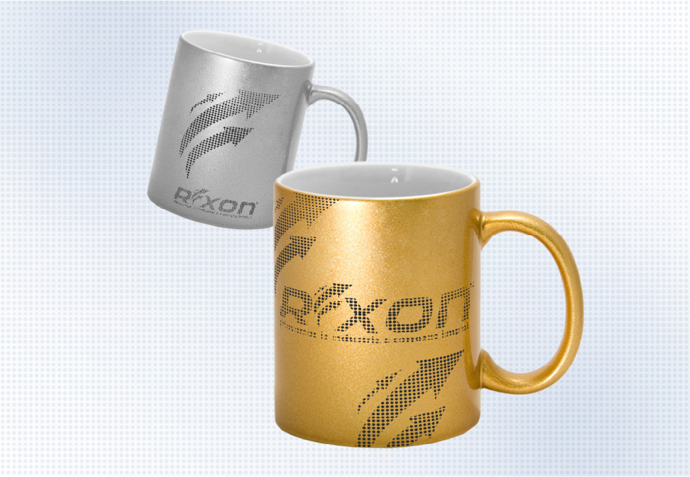
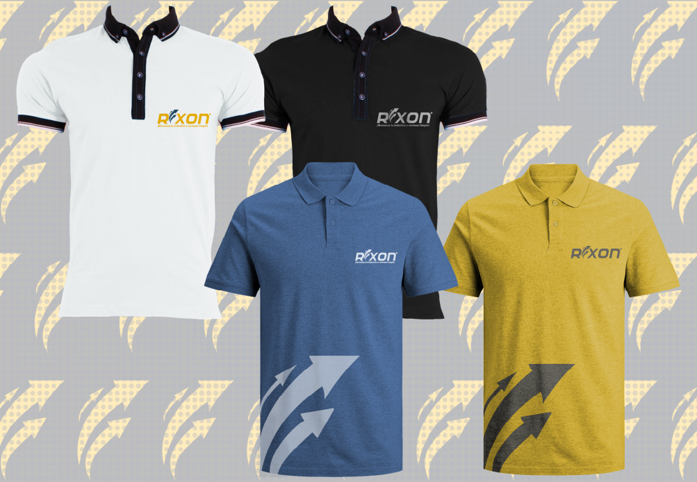
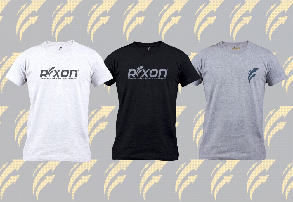
Beyond the manual itself, we also helped implement the refreshed brand identity through:
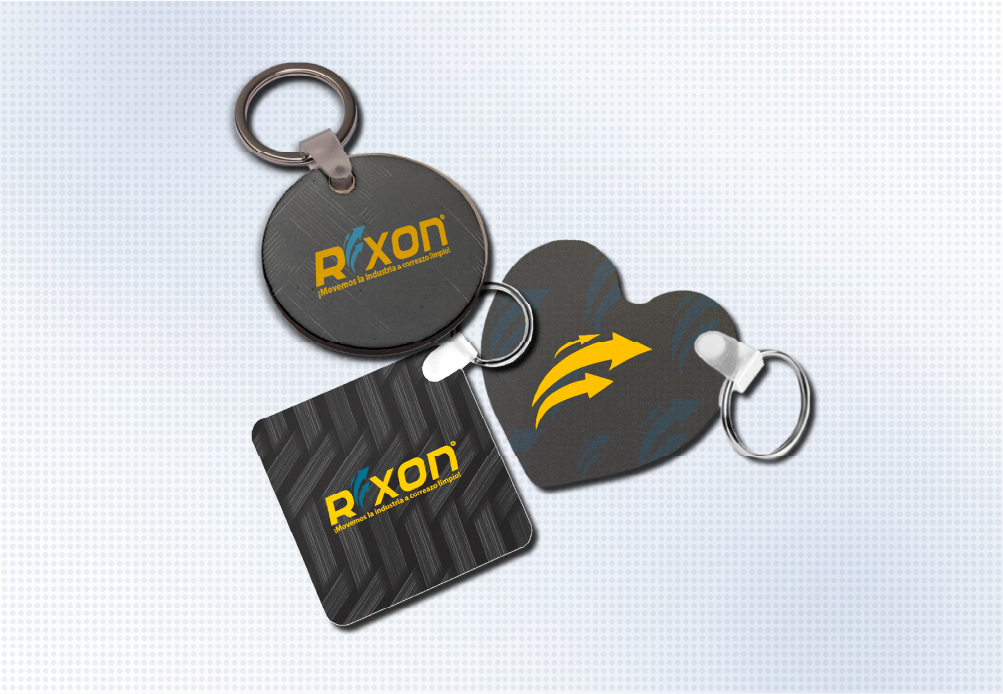
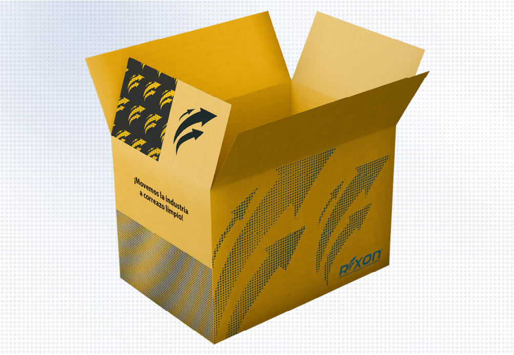
• Merchandising design
• Uniform design systems
• Marketing collateral development
• Advertising materials aligned with the new identity
• Updated visual communication assets
Our goal was not simply to redesign visuals.
It was to create a unified corporate communication system capable of making Rexon feel stronger, more organized, and more professional across every touchpoint.
This strategic approach allowed every department, from sales and marketing to HR and operations, to communicate under one cohesive identity.

The collaboration with Rexon resulted in a complete brand transformation that strengthened the company’s visual consistency and professional image without requiring a logo redesign.
The new brand identity system helped create:
• Stronger consistency across digital and print communications
• More professional marketing and advertising materials
• Better alignment between departments and communication channels
• Improved brand recognition and coherence
• Scalable branding systems for future growth and expansion
• A more modern and organized corporate presence
The implementation of merchandising, uniforms, and updated communication materials also helped reinforce the brand internally while strengthening how Rexon presented itself externally to clients, partners, and distributors.
Most importantly, the project demonstrated that successful branding is not always about changing a logo.
Sometimes the most powerful transformation comes from building clarity, consistency, and structure around an existing identity.
At Creativo Rock, we believe branding should unify organizations from the inside out, helping companies communicate with confidence, professionalism, and long term vision.